Hello fellow WordPressians. Any chance you like a challenge?
Even though it’s a scorcher of a Summer here my mind is gloomy and grey. Finding happy memories is proving a little difficult.
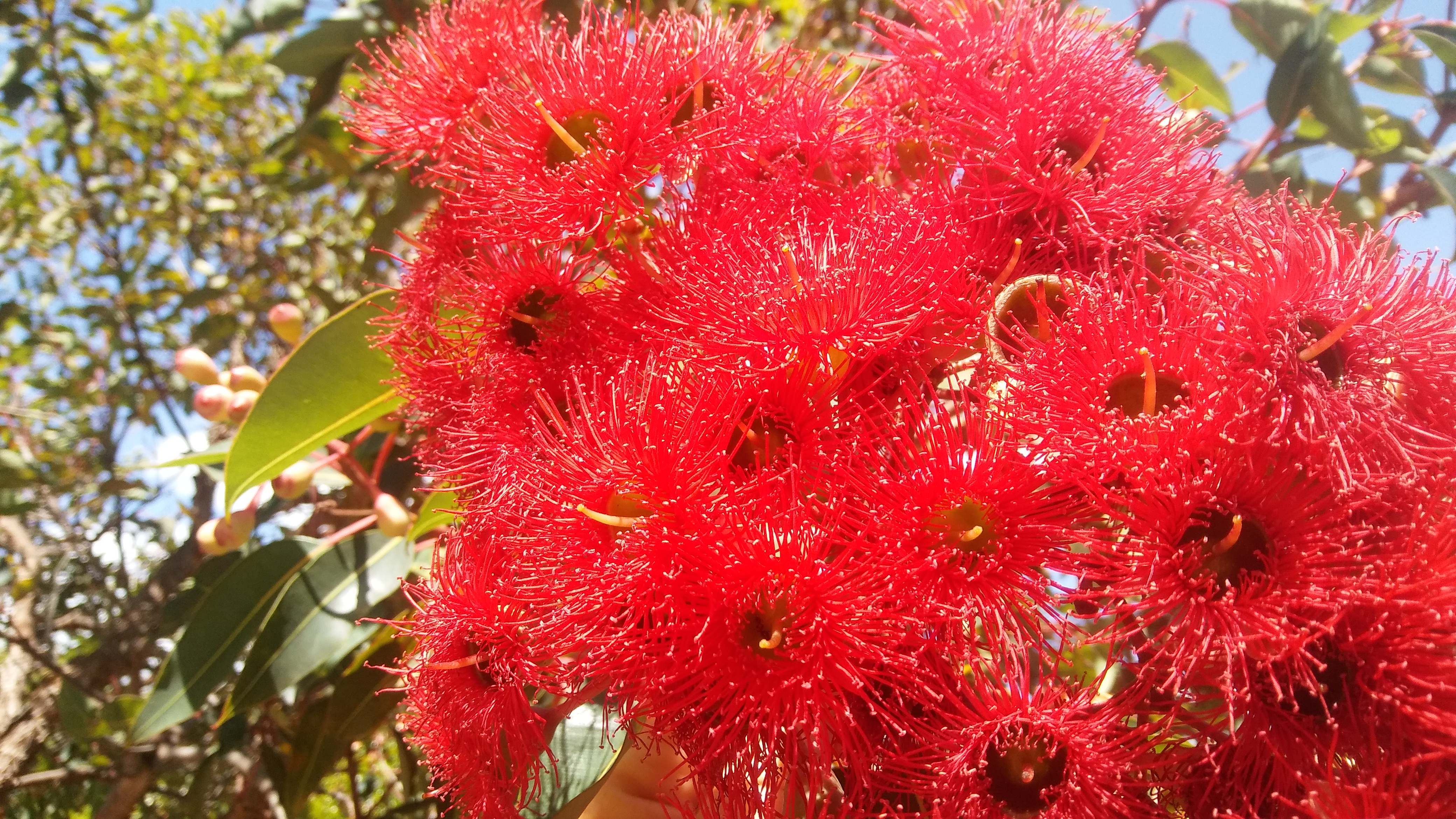
Colours can trigger positive feelings and memories. Anyone who has had even a passing interaction here knows my go to colour is red.
We get the keys to our new home tomorrow and soon we paint. No surprises with the paint I have chosen…

Garish perhaps. But I love it! My happy little red house on the hill. Safe haven. Bright enough to keep the gloominess of my depression at bay at times.
Enough about me. I am curious to hear about you. Up for a challenge?
I would love to learn about your go to colour when you need a lift and how you encorporate the colour into your day.
The more colourful pictures the better of course! If you could add a link to your blog in the comments below so I can read your post, I would appreciate it.
❤ Nat
PS…
Ok I have to admit part of the appeal for me is to see the reader page full of colour like a rainbow. How awesome would that look!

Well…….. that is what I say color. You just have to have colors in your life especially your home. I love colors. Paint my place: Green for the living room, Pistachio for the kitchen, Rose for the bathroom and Sky blue for the bedroom. I did this when I was so depressed. Colors help with the moods. It just happened that today’s post is about colors and harmony in my site. What would you paint the inside of the house?
LikeLiked by 2 people
Your post is fantastic! The artwork pops from the screen it is so bright and happy. I like the idea of red representing God as the Spirit. Posted a reply which seems to have gone awol but I will check again tomorrow.
You are so lucky to have lots of colours indoors. Hubby is very minimalist so indoors I have kept it very neutral and restful. His compromise was I could have ceilings the same a the walls and floor tile whatever colour I wanted. The walls and ceilings will be Taubmans “Taupe Half” and floors a light terracotta 😍.
LikeLike
Oh Nat, this is a good review. Kindlly share your reflection on my post. It’s important to me. Thank you, Perpetua
LikeLiked by 1 person
Hi Nat. I’m just about to put up an image post for you of wallpapers in a shop in Oamaru NZ with beautiful colours and patterns. The sort of thing you’d use as a beautiful feature strip. The post is for you because one of the wallpapers has a gorgeous deep pink background that isn’t too far off the lovely paint colour you’ve chosen. You won’t miss it – it really stands out! Love and hugs, Liz xx
LikeLiked by 1 person
PS. if you click on the photo a few times it’ll go full-size for a good view. At: https://exploringcolour.wordpress.com/2019/01/30/wallpaper-beauties-oamaru-nz/
LikeLiked by 2 people
Reblogged this on Life after Sixty-Five and commented:
Wonderful challenge. Going to do it now.
LikeLiked by 1 person
Hi Nat, here is the link. Thanks for the wonderful idea. https://ramblingsofrenatha.wordpress.com/2019/01/30/add-a-splash-of-colour/
LikeLiked by 1 person
I’ve done a red post for you too: https://exploringcolour.wordpress.com/2019/01/30/bright-spot-red/
LikeLiked by 1 person
I have mugs in a sedate blue for a chamomile de-stressing kind of day and orange for high energy with something to perk me up.
I pretend to drink the color, the way when I was six I used to pretend that really sweet iced tea was moonlight and I could drink it like a unicorn. Only a little more grown up.
LikeLiked by 1 person
What a gorgeous reply! I love the idea of drinking the colour best of all! Funny how as kids we have the best ideas and as adults we lose the joy.
LikeLiked by 1 person